
Use two familiar lighting settings and repeat the same camera position when comparing before and after. If only one photograph looks strange, inspect the surrounding scene before deciding the hair changed. Bring consistent examples to a colorist when a concern remains.
Read the whole photograph before judging the shade
Look at the wall, skin and clothing as well as the hair. If all appear strongly orange or blue, the color cast belongs to the photograph as a whole. Nikon's white-balance guidance explains how illumination and camera color rendering affect the recorded scene. This is why a saved image can show a tone you do not recognize in the mirror.
A photograph can still contribute something when its exact shade is uncertain. It might show where contrast sits around the face or how dark the overall outline remains. Separate those observations from a precise color target. Use the checks below to decide what the image can support before bringing it into a salon discussion.
Choose a few normal viewing situations
Look at your hair in readable daylight, in an indoor setting you use frequently, and in another ordinary situation that matters to your life. You do not need to seek out every possible light source. The goal is to understand the range you regularly encounter. Avoid judging mainly under unusual decorative lighting or a very dramatic spotlight unless that setting is specifically relevant to an event plan.
Write down what stays consistent and what appears to change. You might continue to see the same overall depth while warmth becomes more noticeable in one room. Or you may find that the contrast through the lengths is visible mainly when the hair is arranged a certain way. These observations can help you describe the result without immediately deciding that one view is correct and every other view represents a problem that needs another color service.
Keep comparison photographs consistent
When comparing before and after images, use a similar location, camera position, and hair arrangement when practical. A freshly styled result photographed by a bright window cannot be fairly compared with an older, dim bathroom selfie in every detail. You can still notice broad changes, but the differences in presentation make exact judgments about shine, tone, and dimension less reliable.
Save one straightforward reference photo before a planned color appointment. Afterward, repeat the setup as closely as is convenient. Do not spend excessive time attempting to reproduce every setting. A reasonably consistent image is enough for your own notes. The useful question is whether the intended change is visible under similar conditions, not whether you can produce a technically perfect photographic comparison at home.
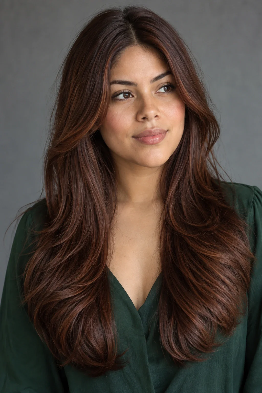
Make a clean comparison without recoloring the evidence
Keep the original photograph when a phone image looks unlike the mirror. Adding warmth, cooling the picture or increasing saturation until it resembles your memory creates a second interpretation. That may be fine for a personal post, but a colorist needs to know which image was edited. A note about the mismatch is more informative than presenting a corrected screenshot as an exact record.
To make a simpler comparison, return to the same location and camera position. Wear a familiar top, use the same part and include the entire hairstyle. Take one photograph facing readable daylight and another in the room where the concern appears. Label the setting, such as window or kitchen lamp. Avoid applying a different preset to each image or judging one on a warm display filter and the other on a different screen.
Now describe what changes between the two. Does the whole scene warm up, or does a particular front section remain more contrasting in both? Is the issue visible to you in the mirror as well? Share that pattern with the salon if you want advice. The goal is a clear explanation of the concern and its context, not an endlessly edited photograph that appears to settle the chemistry from pixels.
Think about viewing distance and arrangement
Subtle dimension may be obvious when you inspect individual sections closely and much quieter when you look at the whole hairstyle. A change in part or the way the length sits can also reveal or conceal contrast. Before deciding the color is too subtle or too strong, view it as you normally wear it and from a normal conversational distance.
Take a broader photograph if your existing images are all tightly cropped. Include the face and some of the clothes you usually wear so you can judge the overall relationship. You may discover that the detail is doing exactly what you wanted even though it is difficult to capture in a close-up, or that one placement becomes more prominent than expected in your everyday arrangement. These are specific observations you can bring to a colorist.
Use previews as directional color sketches
An AI hair color image may help you explore a lighter, darker, warmer, or cooler impression. Keep the discussion relative: more contrast than your current hair, a softer transition, or a less warm impression.
Compare previews on the same device under similar viewing conditions and avoid making tiny shade distinctions the deciding factor. If a direction interests you, collect real hair references and discuss it professionally. A colorist needs to assess your starting point and history. The preview's value is helping you notice a preference, while the consultation addresses whether and how that preference can become a practical color plan.
Describe concerns with examples and context
If you are uncertain about a new color, gather a few clear photographs and note where they were taken. Explain what concerns you in ordinary language, such as a front section that feels too contrasting or warmth that is more noticeable than you expected. Include an image that shows the overall hair rather than only the smallest area you dislike. This gives the salon useful context for a conversation.
Avoid repeatedly changing products or applying another color solely to make one photograph look different. Contact the colorist and ask how to assess the result and what options are appropriate. A specific discussion is more useful than trying to correct an uncertain target yourself. Over time, consistent notes about lighting, arrangement, and the feature you care about will help you choose references more thoughtfully and recognize the difference between a photographic impression and the color direction you want to wear.
Create a small observation set without chasing a single true image
Choose a few places where you regularly see your hair, such as near a window, in your bathroom and in an evening venue. Take a comparable photograph in each setting and label the context. The purpose is to understand the range of appearances you encounter, rather than selecting one picture as the only valid version. Keep the arrangement and clothing reasonably consistent so the notes remain focused. If a photograph shows a striking difference, record what you observed without immediately assuming the hair itself has changed.
Review the set together and identify the feature that remains important to you across contexts. You might enjoy an overall depth in every image while preferring the apparent tone in one setting. That distinction is useful for a consultation because it separates a stable preference from a response to a particular photograph. Avoid editing each image until they agree. The variation is the information you are collecting, and smoothing it away would make the comparison less useful for understanding your everyday experience.
Describe a concern through a pair of examples
When explaining why a color sometimes feels wrong to you, choose two representative photographs and label the difference you notice. Use specific descriptions of the impression rather than relying entirely on a color name. For example, you may feel that one setting makes the contrast more obvious than you intended, while another makes the overall direction feel comfortable. Include a note about where and when each image was taken, along with the hairstyle you were wearing at the time.
Bring those examples to a professional discussion and ask what can reasonably be inferred from them. A photograph is one piece of context, and your description of the wearing experience matters too. Decide which situations you most want the result to serve, while allowing that its appearance will not be identical everywhere. This makes the conversation more practical than requesting a color that always matches a single saved image. It also gives you a clearer way to assess any proposed adjustment against the circumstances you actually care about.
Your questions, considered.
Which light shows the one true hair color?
No single photograph captures every way you will see the hair. Readable daylight is useful for discussion, but the appearance also matters in familiar indoor settings. Compare several ordinary situations instead of treating one image as a complete specification.
Why does my color look different in someone else's photo?
The camera, processing, illumination, and viewing conditions may differ. Compare the surrounding scene as well as the hair and use the image as one piece of information. It does not automatically show that the color itself has changed.
Should I choose a dye from a preview screenshot?
Use the screenshot to explain a broad direction. Discuss the translation with a qualified colorist.
Sources & what they support
The notes below explain the scope of each source. Hairstyle selections, outfit combinations and comparison exercises are HairSparks’s editorial suggestions; the links do not imply endorsement.
- Nikon: setting white balance ↗Explains how lighting and camera white balance affect photographed color. Supports checking color context instead of treating one screen image as an exact shade.
- L’Oréal Professionnel: preparing for a hair consultation ↗Consultation context: bringing pictures, explaining styling habits and discussing maintenance with a professional. It supports the consultation advice, not our aesthetic judgments about individual looks.
HairSparks and Hair Muse share the same publisher. App mentions are promotional. Read our editorial policy.